How to use
How to Use Data Layers
This document provides guidance on how to use the data layers within the Safer Parks Dashboard.
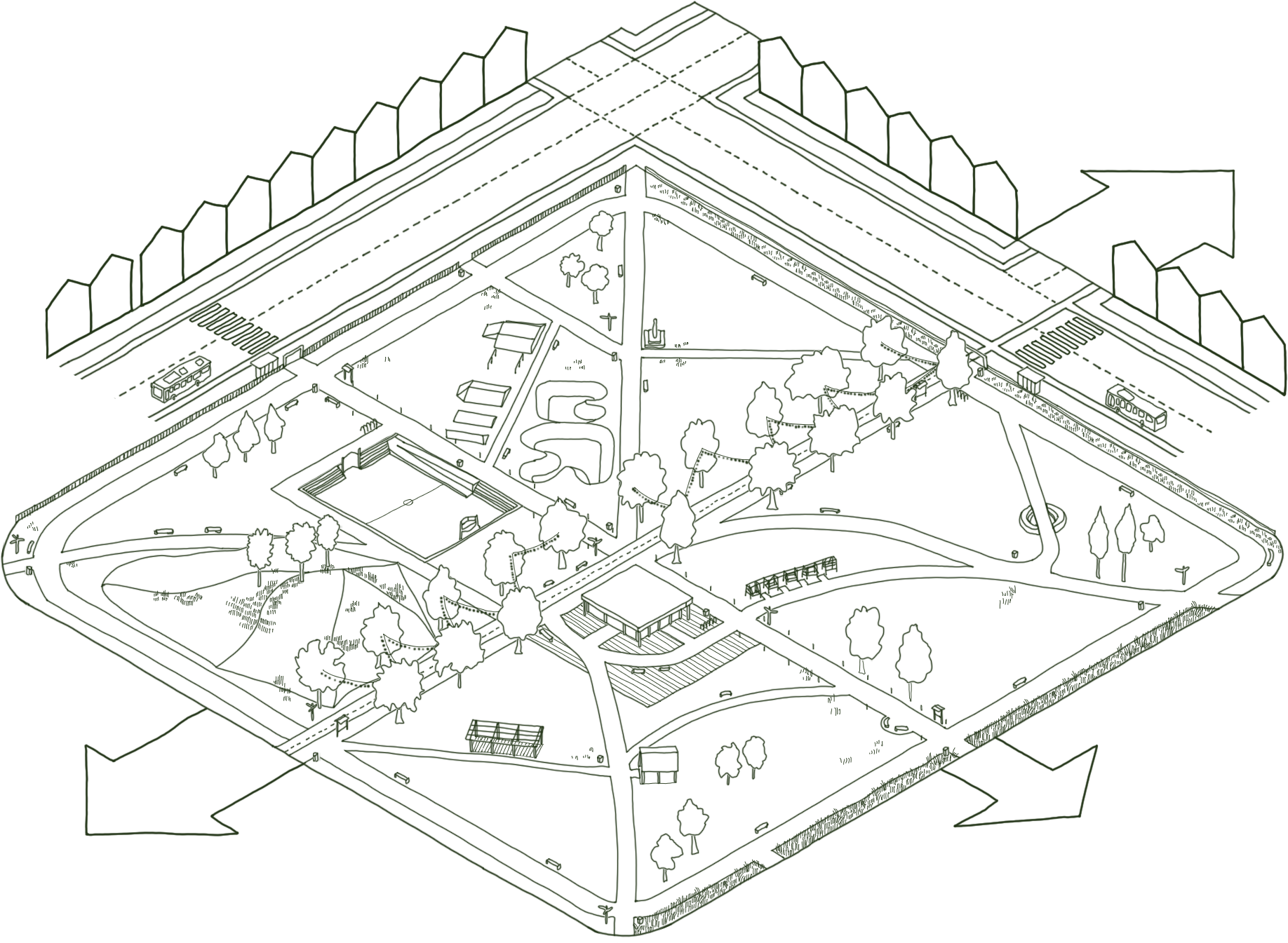
The dashboard is an interactive tool that uses open spatial data to help practitioners improve safety and inclusion in parks and green spaces across England and Wales. It supports the Safer Parks: Improving Access to Women and Girls guidance by enabling evidence-led decisions in design, management and policing.
This should be read alongside the guidance, with each data layer linked to relevant sections.
How to use the dashboard
Using individual data layers
Each layer represents a different aspect of park safety and inclusion. Used on its own, a layer highlights a specific feature, such as where lighting is present or absent, the potential of routes (footpaths) being busy, or where visibility is low. Toggle on a single layer to explore parks in your area and potential issues or opportunities for improvement.
Using combined data layers
The dashboard is most effective when layers are used together. Park safety and inclusion is shaped by multiple factors, for example, a busy route might be poorly lit, or an access point might be obscured by dense vegetation. Combining layers helps build a clear, more complete understanding of where spaces may feel or be less safe. Suggested layer combinations are provided in Section 4.
Data layer guidance
Park Structure
What is this layer?
The boundary of each park. The boundary is displayed as a polygon.
How to use this information
Use the Park Boundary layer as the spatial reference for all other data. It helps to:
Define park extent: What area does the park cover? all other layers are interpreted in relation to this boundary.
Natural surveillance: What surrounds the park perimeter? Nearby streets, buildings, and open land influence visibility and natural surveillance (See Escape: The Safer Parks guidance).
Connectivity: How well does the boundary connect to the surrounding street network? Strong connections can improve access and movement (See Escape: The Safer Parks guidance).
Where is the data from?
This data combines Ordnance Survey and OpenStreetMap greenspace datasets into a single park boundary layer. Parks and formal gardens were identified using the following classifications: Public Park or Garden (Ordnance Survey), Park (OpenStreetMap), and Garden (OpenStreetMap).
What is this layer?
The location of external park entrances or access and exit points. These are displayed as points.
How to use this information
Identify entry and exit points across your chosen park to consider:
Visibility at entry points: Are entrances clearly visible from surrounding streets and from within the park? Poor visibility can undermine feelings of safety (See Escape: The Safer Parks guidance for more information).
Sufficiency of access: Are there enough entry and exit points? Limited options can create a feeling of entrapment (See Escape: The Safer Parks guidance ).
Location on popular routes: Are entrances located on or near popular routes? Access points on busier paths often feel safer (See Busyness and Activation: The Safer Parks guidance ).
Secondary access points: Are there well-used secondary access points? Frequently used secondary routes may indicate key access points or desire lines that could benefit from improvements such as enhanced surfacing, visibility, signage or lighting.
Lighting: Are access and exit points adequately lit? (See Lighting: The Safer Parks guidance ).
Public transport links: Are entrances well connected to public transport, such as bus stops or cycle stations (See Access and Location: The Safer Parks guidance).
What layers could be combined?
For deeper insight, use alongside the Predicted Route Popularity, Visibility Analysis, and Street Lighting layers.
Where is the data from?
Access and exit points distinguish between primary entrances (as mapped by Ordnance Survey and OpenStreetMap data) and secondary or additional entry points to the park (i.e. calculated where a footpath intersects with a Park Boundary).
What is this layer?
Cycling and walking infrastructure within and around parks. The network is displayed as lines.
How to use this information
Use this layer to understand how parks connect to the wider active travel network and where improvements could support safer, more inclusive use, considering:
Visibility and lighting on active routes: Are key routes through the park visible, open, and well-lit, especially those used at peak times? Poor visibility can deter use, even on busy routes (See Visibility and Openness: The Safer Parks guidance and Lighting: The Safer Parks guidance).
Connections to access points: Do routes connect well to access and exit points? Weak connections can reduce use and natural footfall (See Escape: The Safer Parks guidance and Access and Location).
Signage and wayfinding: Is navigation clear along routes within or alongside the park? (See Wayfinding and Layout: The Safer Parks guidance).
Catchment coverage: Does the network serve the full local population, including those who rely on walking or cycling?
What layers could be combined?
For deeper insight, use alongside the Predicted Route Popularity, Street Lighting, Visibility Analysis, Access and Exit Points, and Demographic Data layers.
Where is the data from?
This layer uses OpenStreetMap data downloaded via Geofabrik and filtered to extract active travel infrastructure across England and Wales. The data is split into two layers: cycling (cycleways, cycle lanes, shared paths, bridleways, and tracks) and walking (footways, pedestrian areas, shared paths, bridleways, and tracks). Shared paths, bridleways, and tracks appear in both layers as they serve both cyclists and pedestrians.
What is this layer?
A schematic background map that provides visual context for the park and its surroundings. It shows roads, buildings, green spaces, and water in a simple, stylised format.
How to use this information
Unlike other layers, it is not analytical; it helps orient users and place other data layers within their spatial context.
Understanding surroundings: Identifying nearby streets, buildings, and green spaces around the park boundary.
Orientation: Locating yourself within the dashboard before exploring other layers.
Cross-referencing: Comparing analytical layers with the area’s overall layout.
Where is the data from?
This layer uses OpenStreetMap data, styled by Carto.
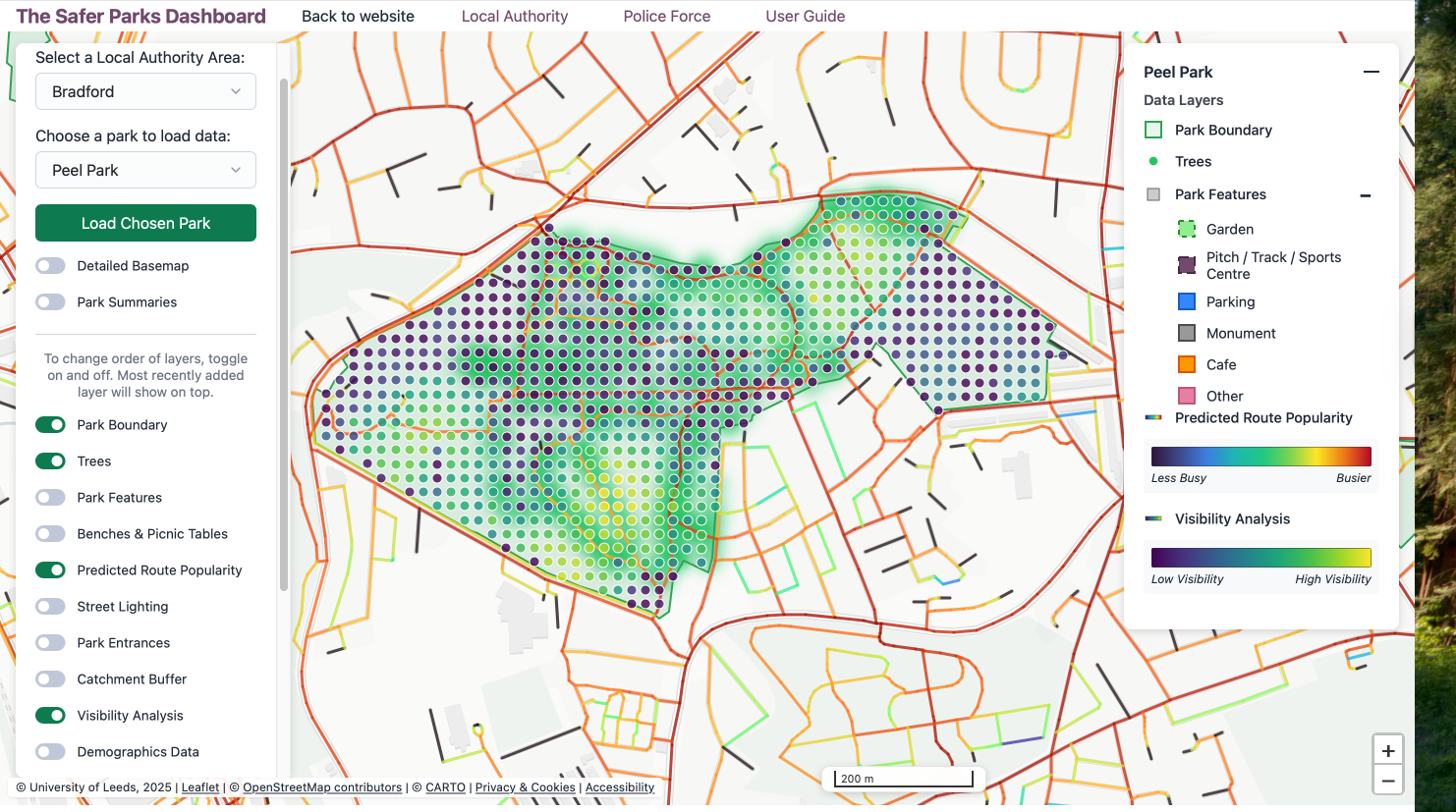
Park Insights
What is this layer?
Illustrates how people are likely to move through streets and paths, showing movement patterns at a neighbourhood scale, around a 10-minute walk. Higher values indicate greater potential for pedestrian movement, footfall, and co-presence. It is displayed as a line network.
How to use this information
Some routes that are more likely to be used for movement through and around the park, based on the structure of the surrounding street network.
Use this layer to identify busier routes and assess how movement patterns relate to safety and design. Consider:
Busyness and perceived safety: Which routes are likley to have higher footfall? These routes may feel safer due to increased presence of people (See Busyness and Activation: The Safer Parks guidance).
Lighting and visibility on popular routes: Are popular routes open, visible, and well lit? Poor lighting or sightlines can undermine safety, event where routs are busy (See Visibility and Openness: The Safer Parks guidance; Lighting: The Safer Parks guidance).
Connection to entrances: Do higher-use routes connect clearly to access and exit points? Stronger connections can support movement, accessibility and natural footfall (See Wayfinding and Layout: The Safer Parks guidance).
Supporting safety on key routes: Are primary routes, particularly those that may be used after dark, supported by lighting, signage, or passive surveillance? Additional measures may be needed to support feelings of safety such as increased visibility from busier areas, patrols, CCTV, or locating activity-generating features (e.g. cafés, ranger bases) nearby.
Improving the path network: Are there gaps, dead ends, or misaligned routes? Enhancing connections and aligning with desire lines can improve movement and perceived safety (See Wayfinding and Layout: The Safer Parks guidance).
Placement of features and amenities: Are facilities located in areas with sufficient footfall? Positioning amenities on or nearby busier routes can increase use and passive surveillance (See Busyness and Activation: The Safer Parks guidance).
What layers could be combined?
For deeper insight, use alongside the Visibility Analysis, Street Lighting, Access and Exit points, and Park Features layers.
Where is the data from?
This layer is based on Space Syntax (University College London, UCL) analysis, using Normalised Angular Choice (NACH) at 800m (approximately a 10-minute walk), derived from OpenStreetMap street network data.
What is this layer?
This layer shows how visually connected different parts of the park are. It considers factors such as elevation, tree canopy height, and shrub height. The layer is displayed as a hexagonal grid.
How to use this information
Areas with higher visibility allow people to see and be seen more easily. Use this layer to identify areas of higher and lower visibility in your chosen park. Consider:
Vegetation management: Are there areas where dense vegetation limits visibility? Targeted management, such as reducing hedge height or lower-level planting along paths – can improve sightlines (See Visibility and Openness: The Safer Parks guidance).
Tree canopy height: Are low tree canopies obstructing views? Raising canopies (i.e. above 2 metres) can help improve lines of sight (See Visibility and Openness: The Safer Parks guidance).
Visibility at access and exit points: Are entrances and exits clearly visible from inside and outside the park? Improving visibility at these points can enhance feelings of safety (See Escape: The Safer Parks guidance).
Wayfinding and signage: Are there areas were low visibility may make navigation difficult? Additional signage and clear routes can support wayfinding (See Wayfinding and Layout: The Safer Parks guidance).
What layers could be combined?
For deeper insight, use alongside the Foliage, Street Lighting, and Predicted Route Popularity layers.
Note on vegetation and visibility: Parks play an important ecological and wellbeing role, and vegetation is a key part of this. While some vegetation can reduce visibility and block sightlines, the aim is not widespread clearance. Use the dashboard with local knowledge to identify targeted, proportionate improvements along key routes and around facilities.
Where is the data from?
This layer uses DEFRA LIDAR data and author-generated analysis. For England, it draws on the 2022 composite dataset (Digital Surface Model and Digital Terrain Model). For Wales, a 32-bit LiDAR dataset is used. Full details are available in the Safer Parks GitHub repository: https://github.com/Safer-Parks/park-vga; and https://github.com/Safer-Parks/park-vga/blob/main/notebooks/finding_lidar_tiles/README_downlaoding.md).
Contextual data
What is this layer?
This layer shows the demographic profile of people living within a 15-minute walking distance of park access or exit points. The area is displayed as a polygon. Data currently includes health, economic activity, ethnicity, country of origin, religion, and household deprivation.
How to use this information
Use this layer to understand the communities surrounding your chosen park. It helps identify who the park’s potential users are and whether the provision reflects their needs. Consider:
Catchment population: Which communities fall within walking distance of the park? This helps identify who the primarily serves.
Identifying underserved groups: Does the catchment include groups who may face additional barriers to park use? This may include women, girls, older people, disabled people, and minority ethnic communities (See Belonging and Familiarity: The Safer Parks guidance).
Facilities and design: Do park features and facilities reflect the diverse needs of the local population? Align features and facilities with community characteristics (See Access and Location, The Safer Parks guidance).
Community engagement: How can this data inform co-production and engagement? Understanding local demographics can help shape inclusive design and decision-making (See Co-production and Engagement: The Safer Parks guidance).
Access and connectivity: Are there areas where new or improved access and exit points could better serve nearby communities? This can improve accessibility, visibility, and perceptions of safety.
Catchment coverage: Do access points and routes serve the full catchment area, including those living at its edges? Gaps may limit equitable access (See Access and Location, in the Safer Parks guidance).
Funding applications: Can this data support evidence-based funding bids by demonstrating need and potential impact?
What layers could be combined?
For deeper insight, use alongside the Park Features, Access and Exit points, Visibility Analysis, Catchment Buffer, and Predicted Route Popularity layers.
Where is the data from?
The catchment buffers are based on an isochrone map, which represents the area reachable from a single point within a specified travel time using a particular mode of transport, such as walking, cycling or public transport.
For each park of 10 hectares or larger (aligned with the Green Infrastructure Framework), we calculated 15-minute walking isochrones from every identified park access and exit point, using the street and path network (assuming 4 km/h walking speed). This approach is effectively the reverse of the DEFRA Access to Greenspace methodology, which also uses 15-minute street-network walking distances, but calculates accessibility from neighbourhoods to the nearest greenspace.
For each park catchment, we examine the people living within it. Demographic data is drawn from Census Output Areas (OAs) which generally contain 40–250 households and 100–625 residents, although rural OAs are much larger in physical size.. We included output areas where at least 20% of the output area is within the catchment area.
To compare the population within the Park Catchment with that of the wider local authority, we calculate the location quotient. (‘Location quotient is a widely used geographic index that measures the relative concentration or distribution of a subarea compared to the entire area’: https://www.sciencedirect.com/topics/computer-science/location-quotient)
Location Quotient (LQ):
- Parkdem = Count of demographic group in park catchment area
- Parkpop= Total population of the catchment area
- LAdem = Count of demographic group within LA
- LApop = Total population within LA
- LQ = (Parkdem/Parkpop)/(LAdem/LApop)
- LQ interpretation + demographic data source info to aid demographic interpretation.
Park Infrastructure
What is this layer?
This layer shows facilities within parks, such as gardens, sports pitches, car parking, monuments, cafes, and other amenities. This layer is displayed as points and polygons.
How to use this information
Use this layer to understand how facilities are distributed across your chosen park.
Parks with a wider range of features tend to attract more visitors and a broader mix of people. Certain facilities, such as cafes and playgrounds, can encourage co-presence and increase activity, contributing to greater ‘eyes on the park’. Consider:
Gaps in provision: Are there areas with few or no facilities? These areas may attract less footfall and feel more isolated (See Busyness and Activation: The Safer Parks guidance).
Gendered provision: Do existing facilities reflect the needs and interests of women and girls? Parks dominated by certain features (e.g. sports pitches or Multi-Use Games Areas) may not support inclusive use (See Belonging and Familiarity: The Safer Parks guidance).
Visibility and accessibility: Are facilities visible and accessible from popular routes? Can you see one destination within the park from another? Well-located features can support use and improve perceived safety (See Wayfinding and Layout: The Safer Parks guidance).
Reflecting local diversity: Does provision reflect the needs of the local population? Ese alongside the Demographics Data layer to assess alignment (See Access and Location: The Safer Parks guidance).
What layers could be combined?
For deeper insight, use alongside the Predicted Route Popularity and Demographics Data layers.
Where is the data from?
This data comes from combined Ordnance Survey and OpenStreetMap data.
What is this layer?
Tree locations and vegetation coverage within parks. It is displayed as a heatmap. Note that this layer is derived fromLidar scans, and so will also capture buildings and other structures that are not vegetation.
How to use this information
Vegetation plays an important ecological role while also shaping sightlines and overall character of the park.
Use this layer to identify where trees and dense vegetation are located within your chosen park. The dashboard reflects a ‘worst case’ visibility scenario, assuming full leaf coverage in summer. Consider:
Sightlines along paths: Are there areas where vegetation close to paths reduces visibility? Dense or overgown planting may obstruct views and affect perceived safety. Use alongside the Visibility Analysis layer to understand the relationship (See Visibility and Openness: The Safer Parks guidance).
Targeted maintenance: Are there locations were maintenance could improve visibility? Measures such as raising tree canopies or managing shrub and hedge height can enhance sightlines without widespread removal (See Visibility and Openness: The Safer Parks guidance).
Boundary and access point visibility: Does vegetation near park edges or entrances restrict visibility from surrounding streets? Improving visibility at these locations can support safety and wayfinding (See Escape: The Safer Parks guidance).
Note on vegetation and visibility: Parks provide important ecological and wellbeing benefits, and vegetation is central to this. While some planting can reduce visibility, the aim is not widespread clearance. Use the dashboard alongside local knowledge to identify targeted, proportionate improvements along key routes and around facilities.
What layers could be combined?
For deeper insight, use alongside the Visibility Analysis layer.
Where is the data from?
This layer uses DEFRA LIDAR data capturing elevation, tree canopy height, and shrub height. For England, it uses the 2022 composite dataset (Digital Surface Model and Digital Terrain Model). For Wales, a 32-bit LiDAR dataset is used. Full details are available in the Safer Parks GitHub repository: https://github.com/Safer-Parks/park-vga; and https://github.com/Safer-Parks/park-vga/blob/main/notebooks/finding_lidar_tiles/README_downlaoding.md).
What is this layer?
Locations of street lighting within and around parks. The layer is displayed as point data.
We provide street lighting data from Open Street Maps: this data is quite sparse, and may not be accurate. For our pilot WYCA areas, we have also used local authority data to supplement the OSM data. We hope to add to the lighting dataset in future, and welcome any contributions from local authorities.
How to use this information
Lighting plays a key role in how safe parks feel, particularly after dark, including during early mornings and afternoons in Autumn and Winter. Parks often form part of active-travel routes, but many women and girls feel unsafe using them in low-light conditions.
Use this layer to identify areas that are unlit or poorly lit within and around your chosen park. Consider:
Unlit paths: Which paths lack lighting, particularly those that are well-used or likely to attract higher footfall? (See Lighting: The Safer Parks guidance). These routes may be priority areas for improvement.
Lighting at access and exit points: Are entrances and exit points adequately lit? Poor lighting at these points can deter use and reduce perceptions of safety (See Lighting: The Safer Parks guidance).
Targeting improvements: Where should lighting interventions be prioritised? Combining this layer with Visibility Analysis can help identify locations where lighting and sightlines together present higher risk.
Supporting safe use after dark: Are areas likely to be used in low-light conditions supported by appropriate management measures? Enhancing lighting may require complementary approaches such as patrols, CCTV, or updated park management plans, including decisions about opening and closing times.
Note: Lighting should be applied selectively and strategically. Decisions should balance likely use, safety needs, active travel, and ecological impacts. Lower-level, evenly distributed lighting can improve comfort and visibility while avoiding excessive brightness glare, and deep shadows.
What layers could be combined?
For deeper insight, use alongside the Visibility Analysis, Access and Exit points, and Predicted Route Popularity layers.
Where is the data from?
This layer uses data provided by local authorities. Street lighting data may not capture all assets. Verify with local authority records and on-the-ground knowledge, and ensure lights are regularly checked sand maintained.
What is this layer?
The location of seating within parks. The layer is displayed as points.
How to use this information
Seating encourages people to spend time in the park, supporting activity, comfort and a sense of belonging. Well-used seating areas can also provide greater ‘eyes on the park’, helping spaces feel safer.
Use this layer to understand where seating is—and is not—located within your chosen park. Consider:
Gaps in seating: Are there areas with no or limited seating? Lack of seating may discourage use, particularly by women, older people, parents, and disabled users (See Belonging and Familiarity: The Safer Parks guidance).
Location and safety: Is seating located in visible, well-lit areas? Seating in concealed or isolated spots may feel unsafe or attract unwanted behaviour (See Visibility and Openness: The Safer Parks guidance)
Accessibility and diversity of seating: Does the type and distribution of seating meet a range of needs? Features such as circular seating, back-rests accessible picnic tables, and shelter from sun or rain can support inclusive use. Consider this alongside the Demographics Data layer (See Access and Location: The Safer Parks guidance).
What layers could be combined?
For deeper insight, use alongside the Visibility Analysis, Foliage, Predicted Route Popularity, and Street Lighting layers.
Where is the data from?
This layer uses Ordnance Survey and OpenStreetMap.
Suggested layer combinations
- Visibility Analysis + Foliage
- Where might vegetation be contributing to poor sightlines? This combination helps identify areas where targeted maintenance could improve visibility.
- Benches & Picnic Tables + Visibility Analysis + Street Lighting + Foliage
- Is seating located in well-lit, visible areas? This combination helps assess whether seating feels safe and highlights whether improvements could encourage use.
- Predicted Route Popularity + Street Lighting
- Are the most-used routes adequately lit? This combination helps identify priority routes for lighting improvements, particularly for after dark and evening use.
- Access and Exit points + Predicted Route Popularity + Demographics
- Do entrances and key routes serve the surrounding population effectively? This combination can highlight where additional access points or improved routes could support greater use and activation.
- Access and Exit points + Predicted Route Popularity + Street Lighting + Visibility Analysis
- What is the safety context at entrances and exits? This combination helps assess how busy, visible, and well lit these areas are.
- Park Features + Demographics Data
- Do park facilities reflect the needs of the local population? This combination supports more inclusive and responsive provision.
- Demographics Data + Park Boundary + Access and Exit points
- Who lives within walking distance of the park, and how well are they served? This combination helps assess whether access and provision reflect local needs.
- Visibility Analysis + Street Lighting + Foliage
- Where are the highest-priority areas for intervention? This combination highlights where low visibility, poor lighting, and dense vegetation overlap.
Guided use case studies: Peel Park, Bradford
The following use cases illustrate how the dashboard can support specific decisions. Each case could be available as a screen recording or annotated screenshot walkthrough in the dashboard.
Data layers used: Visibility Analysis + Foliage + Predicted Route Popularity.
In this example, tree density is shown as a green heatmap, while visibility is represented as a blue-to-yellow grid, with darker blue indicating lower visibility. Predicted Route Popularity is shown as a line network, with colours ranging from blue (lower) to red (higher).
In Peel Park, this combination highlights that the northern section has highest tree density and some of the lowest visibility. At the same time, routes through this area show high movement potential, suggesting it likely to be used as a key connection between the north and south of the neighbourhood. In contrast, more open areas in the southwest and northeast have higher visibility.
What does this show?
Where dense vegetation overlaps with routes people are likely to use, low visibility may affect perceptions of safety. This helps pinpoint where targeted intervention is most needed, rather than applying changes across the whole park.
What could be improved?
Measures such as raising tree canopies above 2 metres or maintaining shrubs alongside paths could improve visibility without large-scale removal.
Additional insights
The map also highlights areas in the southeast of the park with both low visibility and low movement potential. Could new routes or access points help increase activity in these areas? Introducing a connecting path extending from the busier areas, alongside measures such as an additional access point, patrols, CCTV, and vegetation management. This way, an area with low visibility and low potential for movement, could potentially increase footfall, co-presence, and natural surveillance —helping these areas feel safer.
Data layers used: Predicted Route Popularity + Street Lighting + Access and Exit points + Visibility Analysis.
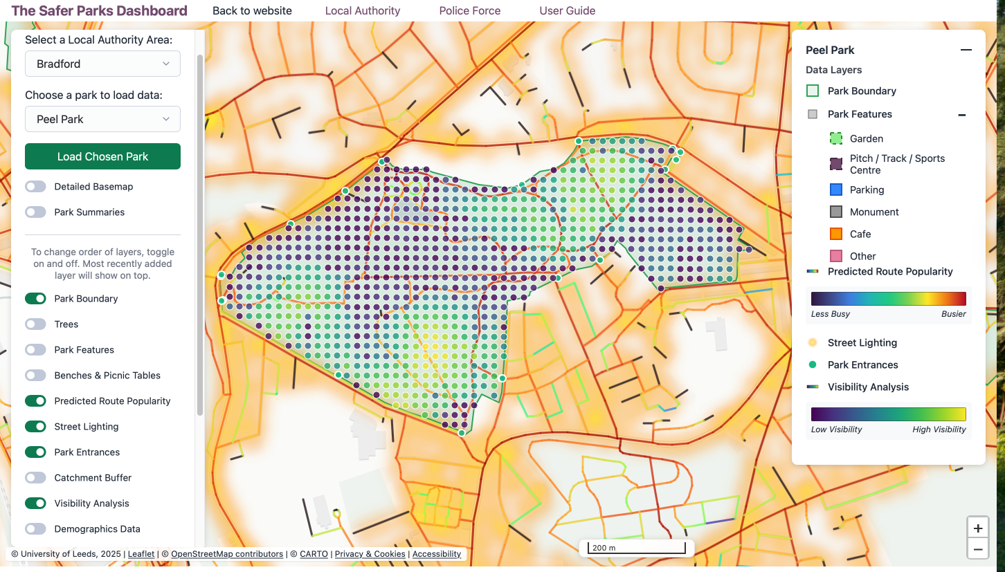
In this example, street lighting is shown as a yellow heatmap, while visibility is represented as a blue-to-yellow grid, with darker blue indicating lower visibility. Predicted Route Popularity is displayed as a line network, ranging from blue (lower) to red (higher), with access points marking park entrances.
In Peel Park, lighting is concentrated around the park perimeter and along surrounding streets. In contrasts, the park interior, where some routes show high movement potential, is without coverage. Several access and exit points on the north and south edges connect through suggesting a key crossing route, yet the route is largely unlit.
What does this show?
Where well-used or high potential routes pass through poorly lit areas, especially between access points, this may affect perceptions of safety and discourage use after dark. The visibility layer shows that some areas have low visibility not only due to vegetation but also changes in terrain.
What could be improved?
Could lighting be introduced or enhanced along interior routes with higher predicted footfall? Improving lighting at key access points too, particularly where people transition from well-lit streets to darker park areas, may also support safer and more confident use.
Added lighting alone may not fully resolve the issue of feeling unsafe. Any improvements to lighting should be accompanied by a park management plan covering those hours of use. Other measures may include patrols, CCTV, and on-the-ground management to ensure that extending legitimate uses of parks. Signage may be used to signpost well-lit routes.
Additional insights
The northern section of the park, identified in Use Case 1 as having both high tree density and low visibility, also lacks interior lighting. This makes it a priority area when factors combine to reduce perceived safety.
Appendix: Dashboard Layers and Crime Prevention Frameworks
The Safer Parks Dashboard layers have been designed in alignment with the Safer Parks guidance (Safer Parks Consortium, 2025). They also connect to broader crime prevention frameworks, including the Ten Principles of Crime Prevention developed by Secured by Design, and the evidence base on effective interventions to reduce violence against women and girls in public spaces (Home Office, 2025). The table below maps each dashboard layer to the most relevant crime prevention principle, where applicable.
| Data layer | Relevant principle | Summary |
|---|---|---|
| Park Boundary | — | — |
| Access and Exit Points | Principle 5: Access Control | Reducing or managing access to vulnerable areas limits criminal opportunity. Understanding entry and exit points supports decisions about park access design and management. |
| Active Travel Route | — | — |
| Basemap | — | — |
| Predicted Route Popularity | Principle 6: Surveillance | Natural surveillance is strengthened by the presence of people. Routes with higher footfall support informal surveillance through activity and visibility. |
| Visibility Analysis | Principle 6: Surveillance | Clear sightlines support natural surveillance. Areas with poor visibility may reduce the perception of safety and limit informal oversight. |
| Demographics Data | — | — |
| Park Features | Principle 7: Environmental Change | Well-designed and maintained environments are less likely to experience crime. Facilities and amenities attract activity and contribute to a sense of care and ownership of space. |
| Trees | Principle 7: Environmental Change | Vegetation contributes to environmental quality but can also reduce sightlines. Thoughtful planting and maintenance support both amenity and safety. |
| Street Lighting | Principles 6 and 9: Surveillance; Increase the Chances of Being Caught | Lighting supports both natural and formal surveillance and increases the likelihood that offenders will be seen and identified. |
| Benches and Picnic Tables | Principle 7: Environmental Change | Seating encourages people to spend time in parks, increasing natural surveillance and a sense of community ownership of space. |
References
Safer Parks Consortium. (2025). Safer Parks: Improving Access for Women and Girls (2nd ed.). Leeds: University of Leeds. https://doi.org/10.48785/100/352
Secured by Design. (n.d.). The ten principles of crime prevention. https://crimeprevention.securedbydesign.com/the-ten-principles-of-crime-prevention
Home Office. (2025). What works to reduce violence against women and girls: A summary of the evidence. Crown copyright. https://assets.publishing.service.gov.uk/media/6943f8a5143d960161547e74/31.260_VAWG_03_Evidence_Review_FINAL_181225_WEB.pdf
Department for Environment, Food & Rural Affairs (DEFRA). (2022). LiDAR composite digital surface model and digital terrain model. Data.gov.uk. https://www.data.gov.uk/dataset/f0db0249-f17b-4036-9e65-309148c97ce4/national-lidar-programme
OpenStreetMap contributors. (2024). OpenStreetMap data via Geofabrik. https://download.geofabrik.de/